
A while back, I noticed a funny thing about the year-over-year rate of change in the Case-Shiller index of San Diego home prices. It seemed that movements in the annual price change rate from positive to negative or from negative to positive provided a good indicator that the long-term price trend had changed direction.
Allow me to demonstrate with some graphs.
The graph below shows the home price index in blue with the year-over-year rate of change for the index in orange. It covers a ten-year period more or less centered around the early-1990s housing bust.
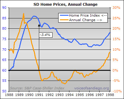
In the month that the annual rate of price change flipped from positive to negative territory, the price index was down just 3.4 percent from the peak. It would go on to drop a total of 17.2 percent over the duration of the downturn. So the “sign reversal” of the annual rate of change provided a fairly early indication that the long-term direction of prices had switched from up to down.
This indicator worked even better in the more recent boom. When the annual rate of change went from positive to negative, the home price index was down a mere 1.2 percent — hardly a sliver of the overall 42.3 percent drop that had taken place as of earlier this year:

In the 1990s, this signal worked in the other direction, too. The first month that the annual change rate sustainably turned positive, the price index was only 1.4 percent above its 1996 trough. That 1.4 percent doesn’t seem like all that much considering that the index would eventually rise by (are you ready for this?) 251.5 percent.

Note, however, the use of the word “sustainably.” In 1994, there was a brief head-fake into positive territory, with the annual change rising at a whopping .1 percent for two months in a row. At that point, over two-thirds of the decline had already taken place, but the foray into positive annual rates was not a sign of a major trend change. So it might be better to say that the trend change was only signaled by a reversal in the year-over-year rate that lasted for several months. Generally speaking, however, the fact remains that changes in the annual rate of price appreciation from positive to negative and vice-versa have provided an interesting tell as to the direction of the underlying trend.
This makes a certain amount of sense. The housing market normally moves like a battleship — huge and very slow to turn around. A change in the major trend could typically be expected to involve a deceleration, then a period of flattening, and finally acceleration in the other direction. The year-over-year change rate typically might not hit zero until the battleship itself had made some progress in its turn.
I bring this all up now because, if my little Case-Shiller estimation technique is to be believed, we may be just about to go positive in the annual rate of change of San Diego home prices. As of last month, the estimated index value was down just .1 percent from its value a year prior. Given that home prices were falling fast late last year, it’s likely that the annual rate will hit positive territory this month.
Here’s a look — note that the estimated index has already risen 10.0 percent from its low point earlier this year:

Interesting, no?
Well, I thought so, anyway. But while interesting, it might also be fairly meaningless. Some reasons follow.
First, the market isn’t really acting like a battleship right now. Maybe it’s more like one of those pontoon party boats. The upturn in prices is much more abrupt than anything seen prior, as the 7-month, 10 percent rise would indicate. And since the typically battleship-like behavior of the market really provides all the reasoning behind the theory that changes in the rate signal changes in the trend, perhaps that theory doesn’t apply this time around.
Second, there is a factor that is unique to this particular housing cycle: the all-out government effort to prop up home prices. Almost by definition, these tactics work by enticing buyers who might have waited for the future to instead buy in the present. This is all well and good for today’s prices, but it drains the supply of future buyers. So the typical pattern of a slow transition from weakness to increasing strength could be replaced this time around by more short-term volatility within a long-term trend that is flat or at least less defined.
Third, we are dealing with a very small sample set. And this indicator didn’t work well at all in the early 1980s, when prices stayed fairly flat while inflation did the work of reducing home valuations in comparison to rents and incomes. (This, incidentally, is a possible outcome for our market as well).
Sooooo… I don’t think anyone should make too much of these graphs and relationships, but I think they make for an intriguing historical comparison. And, like everything else, they bear watching.